Thursday 13 February 2014

Finished Digipak

Here is the finished product of my digipak.
Here is the finished product of the is front of my digipak.
Here is the finished product of the the inside of my digipak.


Here is a gif I have made using gifmaker.com to show the process of the making of my digipak.

I have used Adobe Photoshop on Apple mac to create my digipak, during the process in the making of my digipak I under come some difficulties using Photoshop as I had never used Photoshop before. After playing around with Photoshop I feel that I have achieved a good outcome for my digipak considering I didn't have a clue at what I was doing at the start of the making process.
What really helped me for the making my own digipak was looking at other existing digipak's and Cd's and also albums which were colourful because that is what I was aiming for my digipak to look like and I think that is what I have achieved.


Making of the digipak

To create my digipak I had taken photos by looking at Katy Perry existing albums of hers. There were many influences behind my ideas for my digipak one of them were Katy Perry Prismatic Tour Poster and the photos from her tour.

This is Katy Perry's poster for her tour called 'Prismatic World Tour'. This was my first influence towards my digipak, the poster first influenced me because of the pastel colours used on it. I liked the way the poster has been made by the triangle with Katy Perry in the middle of it. This represents her album 'Prism' and her tour called 'Prismatic World Tour' all on the same poster which I found really clever.
Here is an advertisement of Katy Perry 'Prism' album which I found on the internet. What I liked about this is that is simple but effective at the same time. Once again there's a triangle with Katy Perry inside of it. Behind the triangle there seems to be a jungle this may represent that her album will be a new journey for her. The name behind the album is called 'Prism' this may represent the triangle used on the front of the album. 

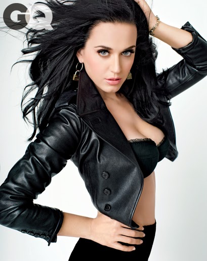
Photos which I have seen on the internet that has inspired my ideas for my digipak are the photos from her 'Prismatic' tour.


I have used Photoshop to create my digipak for ' Prism', the measurements I used to create the first image on the album was 12.5cm x12.5cm this image is above. This image I had taken in school using one of the people in my group called Jodie as my model. In advance to this I had looked at the way Katy Perry poses before I had any taken photos, so I then knew what poses I wanted to Jodie to do for my digipak. I also looked at the way she dresses and the way her make up is like and I took this in too account for these photos. In school we have a photography club and my group organised a day were we used the room and set up our shoot for the photos to use for our digipaks. We used the white wall as the background for our photos, we also used lighting in the shoot. We all took our individual photos for our digipaks using Jodie as the model. 
This is my final finished digipak for the album 'Prism'. I have used Photoshop to create my digipak.Below is the descions  made while creating my digipak to the final digipak


This is a gif of the process of the making of my digipak cover.


This is the final piece for my finished product of my digipak.


This is a screen shot of the design making the digipak I am writing the lettering of Katy Perry down the side.
This is a screen shot of the  where i have put the tracklist on the back of the digipak. For this I have used spacefont.com for the name of the songs on the back. I have decided to use this type of font on the back of my digipak because it is simple compare to the rest of my digipak.          


This is where I first started the design making of my digipak. In advance I had already made a basic design for the front of my digipak using photo shop


For my digipak I looked at the colours used for Katy Perry's Album 'Prism' closely and decided to edit my digipak using the simular pastel colours which she has used on her album 'Prism'. On her album it has a faint rainbow effect over the top of it and that's what has influenced me to try and do it on my own digipak. Below are 2 different designs of my digipak using a rainbow effect over the top of them. 


I think that my rainbow effects on my digipak aren't as successful as Katy Perry's album so I decided to scrap the idea of the rainbow effect because I don't think it's quite effective.Instead of using the rainbow effect on my digipak I decided to only edit the writing on the logo of prism with only a slight rainbow effect as I think this looks so much better than the orginal idea. Below is my final finished digipak that I have made using photoshop.


For my track list on the back of my digipak I have looked existing ones that have influenced my own design of my digipak. I have looked at the back of Boys Like girls album 'The Great Escape'. I have also looked at Kylie's album because of the way the letter is separated and placed out for the track list on the album.

Fonts Ideas for Digipaks

I have used websites such as dafont.com and fontspace.com to give me ideas of fonts for my digipak. I have looked at range of different fonts and different coloured fonts. I have type the word 'Prim' because that is the name of Katy Perry's album where the song 'Roar' that we used for our music video came from.

I have looked at different lettering that i will use for my digipak. I have looked at different 


Here is a gif of the fonts I have decided to use for the front of my digipak, I have looked at different colours in this font and I decided to use the black font because it is simple, bold and also sophisticated compared to the rest of the colourful digipak.

Ideas for Digipak

I have looked at photos of Katy Perry and have found some that have influenced my ideas for my digipak.Below are photos I have looked at for influence and next to them are the photos I have taken to see the simularities of these poses and styles, these photos I am going to use for my digipak and my Cd magazine advertisement.


This photo of Katy Perry has influenced my own photo of Jodie, I decided to change the pose a bit for a more sophisticated look without poking the tongue out as I am going to for a more classy look.


In school we are very fortunate to have our very own photography club.I was able to take photos for my digipak and magazine advertisement in the schools photography club. I have used Jodie to model for my photos as she has already has some experience in modelling and is signed up to a modelling agency hersel. I have decided to use Jodie as the model for my photos because as I said she already has experience in modelling as she is a model herself, it will also benefit the quality for the photos for the digipak and the magzine advertisement because she knows how to pose and she won't feel uncomfortable doing this because she's done it before. In advance to these photo being taken it took a lot of planning by looking at the way Katy Perry poses in her photos, the type of clothes she wears and the way her make up is applied.Below are all the photos I have taken for the digipak and the Cd magazine advertisement.


One day in school we booked the room out to take these photos. Jodie brought make up and clothes in to school and we were able to set up a min photo shoot. We used a white drop back and also professional lighting for our photos which made these photos look really professional and it make it easier when it comes to the editing aspect as we can edit it easier because of the white back ground. Jodie stood in front of white back drop while Jess and Me took it in turns to take photos for our digipaks. Props that were needed to take these photos were the professional lighting, umbrella, white drop back, stool and I also used a fan to give the photos a dramatic effect to give it a stand out statement. All the photos we had taken are very different so none of our photos are the same but totally the opposite.I have edited all these photos using picasa 3 photo editor to bring the colour out more and make them more clear.


I have decided to make gifs using these photos because these are my favourite photos from the ones I have taken above. I have made these gifs using glickr.com. I have made these gifs because it will make me decided what I'm going to edit the photos like for my digipak, deciding what colours I want on my digipak.

These are a ruff draft on what I want my front cover of my digipak to look like, I have never used photo shop so I hope to improve my photoshop skills during this process. I have taken into account that the album is called 'Prism' so for my first attempt of using photo shop I have used a wedding font to created the triangles down the side of my first draft of my digipak. I then used another font to write Prism diagonally down the side of it. I have decided to use this photo and edit in black and white because it is more dramatic and I feel that it stands more in these colours.


After messing around with Photoshop I soon got the hang of it and I have made a better version of my front cover for my digipak.I decided to use a different photo but still keep it in black and white. I also decided to keep the idea of using the wedding font for the triangles down the side of the front.I think I will use this for my final idea to produce the rest of my digipak.

Saturday 8 February 2014

Mood Board (KP)

I have created a mood on using images of Katy Perry. I have decided to create this mood as it will give ideas on what type of images I have to take to for my digipak and magazine cover. I have looked at variety of different pictures of Katy Perry and the way she poses for photos, this will influence me for ideas for my photos.
For my photos I am going to take for my magazine and digipak I will have to look at the way she dresses, the way her hair is done, the way her make up is done to do a comparison of my photos I am going to take and the one of Katy Perry.

Friday 7 February 2014

Existing Digipaks

After researching into what digipaks are I have looked at existing digipaks for the genre pop.
I have researched digipaks on the same genre as song 'Roar which is pop, because I will then know what the conventions for the pop genre for digipaks are by doing research into existing digipaks.

Katy Perry Digipak


This is Katy Perry's digipak called "One of the boys" it was released on June 17 2008 under the production companies of Virgin Records and Capitol Records.This digipak contains three pictures of the artist Katy Perry posing in three different ways. The first photo is close up shot of Katy Perry looking mysterious into the camera, the second photos is a mid shot of her sitting in a paddling pool whilst sitting on an inflatable blow up duck and the last photo of her is also a mid shot her sitting in a paddling pool pulling a headband tightening it in her hair but looking at an angle to the left hand side. The surroundings behind her on the digipak is set in garden, this garden is full of bright colourful roses sitting along side a white fence which sets the scene. The colours used on the digipak are bright and cheerful colours that are very harmonious.The cd disk contrasts well with the rest of the digipak because of the colours Katy Perry is wearing. The cd disk has a strawberry on it, it juxtaposes with the strawberry pattern on her top and the flavour of her lip gloss because it is also a strawberry colour. The strawberry on the dis, her clothes, the colour of her lip gloss ad the also the fruit in her connotes to her sweet personality. 

 This digipak tells a story for a new beginning, before she had released this album she was known as Katy Hudson but she changed her name to Katy Perry because it's her mother maiden name. She changed her name because she got singed up to a new record company and she also decided to change her to Katy Perry because she changed her type of music genre to pop from a gospel singer to pop. 


Beyonce Digipak


This digipak is Beyonce's B'Day digipak it was released
 on September 4th in 2006 under the production company of Sony Urban Music, Music World Music and Columbia Records. Beyonce digipak consist ofseveral different pictures of her from her first album because BDay is Beyonces second album, on the digipak it also includes two different cds with her tracks on. 


Katy Perry Digipak
This is Katy Perry's digipak called 'Teenage Dream' it was released in 2010 under the production of the record label capitol label. Katy Perry's digipak consists of 

Avril Lavinge's Digipak

This is Avril Lavigne called


Rihanna's Digipak
This is Rihanna's album called Loud it was released in 2010 on November 10th under the record company of Mecury Records.I have decided to look at Rihanna's digipak because it pop genre and is the same genre as the music video music we have made. Rihannas digipak consists of picture of her lying in a bed of vibrant red roses and a close up of her face and with a pale pastel pink cd with roses on it.The title of the album is called Loud the roses and the colour of Rihanna's hair juxtapose to the name of the album it is sufficient to the bright colours used.The front of the digipak is a close up of Rihanna's face  focusing on her facial features covering her imperfections due to the use of the saturation of the colours. The digipak is really effective because it is simple showing a picture of Rihanna laying among the bed of roses over the back pannels of the digipak. The lettering used on the digipak is plane but fits in which the rest of the digipak which is busy and full of colour.