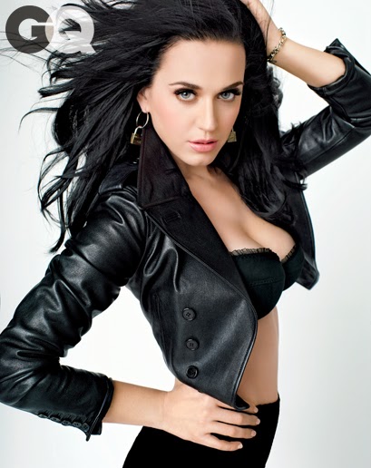
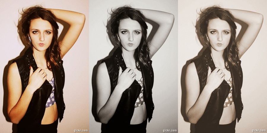
 This photo of Katy Perry has influenced my own photo of Jodie, I decided to change the pose a bit for a more sophisticated look without poking the tongue out as I am going to for a more classy look.

.jpeg)
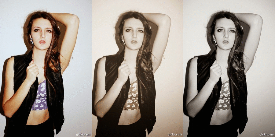
In school we are very fortunate to have our very own photography club.I was able to take photos for my digipak and magazine advertisement in the schools photography club. I have used Jodie to model for my photos as she has already has some experience in modelling and is signed up to a modelling agency hersel. I have decided to use Jodie as the model for my photos because as I said she already has experience in modelling as she is a model herself, it will also benefit the quality for the photos for the digipak and the magzine advertisement because she knows how to pose and she won't feel uncomfortable doing this because she's done it before. In advance to these photo being taken it took a lot of planning by looking at the way Katy Perry poses in her photos, the type of clothes she wears and the way her make up is applied.Below are all the photos I have taken for the digipak and the Cd magazine advertisement.
One day in school we booked the room out to take these photos. Jodie brought make up and clothes in to school and we were able to set up a min photo shoot. We used a white drop back and also professional lighting for our photos which made these photos look really professional and it make it easier when it comes to the editing aspect as we can edit it easier because of the white back ground. Jodie stood in front of white back drop while Jess and Me took it in turns to take photos for our digipaks. Props that were needed to take these photos were the professional lighting, umbrella, white drop back, stool and I also used a fan to give the photos a dramatic effect to give it a stand out statement. All the photos we had taken are very different so none of our photos are the same but totally the opposite.I have edited all these photos using picasa 3 photo editor to bring the colour out more and make them more clear.


These are a ruff draft on what I want my front cover of my digipak to look like, I have never used photo shop so I hope to improve my photoshop skills during this process. I have taken into account that the album is called 'Prism' so for my first attempt of using photo shop I have used a wedding font to created the triangles down the side of my first draft of my digipak. I then used another font to write Prism diagonally down the side of it. I have decided to use this photo and edit in black and white because it is more dramatic and I feel that it stands more in these colours.
After messing around with Photoshop I soon got the hang of it and I have made a better version of my front cover for my digipak.I decided to use a different photo but still keep it in black and white. I also decided to keep the idea of using the wedding font for the triangles down the side of the front.I think I will use this for my final idea to produce the rest of my digipak.


No comments:
Post a Comment